whathifi.com gets a fresh new look

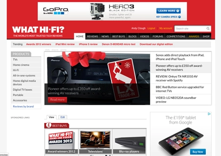
Welcome to the new-look whathifi.com. We’ve given the site a makeover with a new, simpler and fresher design.
The functionality remains the same, but we’ve added a bigger Carousel and more videos to the Homepage, simplified the use of colours and adopted more modern typography. We've improved in-site search too, so it should be easier to find what you want.
You’ll spot a new ‘trending’ bar at the top of the Homepage, a more prominent position for our latest videos and a simplified structure for our For and Against comments on all the reviews.
We've also added social media buttons giving you quick links to our Facebook, Twitter, YouTube and Google+ pages so you can follow us wherever you are.

And a link at the bottom of the Homepage takes you straight to iTunes where you can get our iPad app and download the digital edition of the mag directly to your tablet.
Don’t forget you can also compare prices and check out the latest deals on the new whathifi.com shop, with ‘Buy Now’ and ‘Available from’ links on many reviews.
The all-important Awards section and Best Buys remain, and we’ve no doubt you’ll let us know what you think of the new look on the Forums.
We’ll be doing a bit more tweaking over the coming days, so bear with us while we do.

Follow whathifi.com on Twitter


Comments
It looks bloody awful! Why change it when it was fine??
We've capped that particular ad so you should only be served it once or twice each time you log on.
I don't like the advert that opens up like a curtain across my screen when I arrive at the site. I know you need to make money from advertising but that particular way of displaying an Ad is very annoying!
New site design is good though. I've not noticed any change to download speeds others mention.
'Access denied' seems quite a common Drupal bug - I've found it's where the revision system (if you're using one) has no published version of the content...
LIke the new look. Don't like the way it logs me out after 20 mins...
ok for the 14 year olds, time to move on, goodbye what hifi
Good job! Nice to see some positive changes and you haven't thrown the baby out with the bath water. (remember the BBC Sport website redesign?)
Anyone having issues with ads should install AdBlock Plus, that will sort them out.
The access denied issue is one we're looking into.
Could also do without that hugely irritating Samsung ad that pops up over the entire page whenever I try to click on an article on the front page...
I totally agree with relocated re that ridiculous word "trending".
Also the pages seem smaller and less design-rich than the previous incarnation which is very disappointing. But I guess it's the slavish desire for smartphone readability which is to blame. I notice that in the review section, you even criticise a Cyrus streamer for not having a smarthphone app to control it! Hilarious! Not everyone uses or covets smartphones. I don't own one and I think I know only four people over the age of thirty who do.
In addition, I've been automatically signed out several times, and can't look at a lot of the Tech Specs in the Reviews without getting the message "ACCESS DENIED" - is this a glitch caused by the new design or something else entirely?
Well it looks modern and I am sure it wasn't cheap or easy to do. Trouble for me is that it takes about 3 times as long to load each page.
And why oh why do you have to have a "trending" bar? Couldn't you have just had the bar without the use of this pathetic now word? Infantile.