I love the quality that Tidal offers – but please, make it more user-friendly
A little style to go with all that substance

The latest hi-fi, home cinema and tech news, reviews, buying advice and deals, direct to your inbox.
You are now subscribed
Your newsletter sign-up was successful
After a long and relatively happy union, my time with Spotify has come to an end. With prices rising and the promise of hi-res audio retreating further into the distance every time it seemed in grasp, like some kind of Tantalean torture, the time finally came to commit to the five-star embrace of Tidal. I’ve never been happier, I promise.
If you’ve got a proper source to enjoy and some sufficiently capable headphones to do the service justice (neither is too much of an issue in this line of work), the quality you’ll discover outstrips anything that Spotify can muster.
Yet new relationships always have their teething problems, of course, even amidst the hazy glow of those first love-struck days, and it’s been hard to ignore the shortcomings of an otherwise superb service.
Article continues belowHappily, these limitations seem to derive from the platform’s limited grasp of usability and accessibility, areas in which most rivals remain relatively strong. No one’s faulting the quality of the files or the breadth of music on offer, but in a couple of areas at least, Tidal still feels like a platform designed by people who never went back and tested what it was like to operate.
It’s a great place for aficionados, but its basic blind spots may present a trickier challenge for the average listener.

Organisation, organisation, organisation
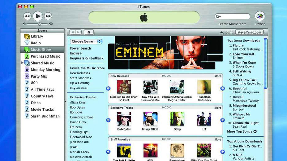
Before washing up on the sandy shores of Spotify, I was a fully paid-up member of Club Apple. Originally, this wasn’t even the streaming service Apple Music, you understand, but the built-in iTunes platform on which your saved and downloaded files that would be stored permanently on your laptop and then played on any given device. Remember that?
To me, Apple has by far the best system going – it certainly did on iTunes and, as far as I can tell, that beautifully streamlined way of doing things has passed over to its popular streaming platform, too. Say you’ve got three tracks from Muse’s much-dismissed debut Showbiz, and let’s also say for the sake of argument that those tracks are Uno, Overdue and Sunburn.
The latest hi-fi, home cinema and tech news, reviews, buying advice and deals, direct to your inbox.
You have a beautifully logical system at your disposal for accessing those tracks: you can go to artists (Muse), which will take you to each album from which you have any tracks saved, which will then grant access to the three tracks you want. Or you can go straight to albums and get the same result. Or you can look at your full song list and discover the same three tunes right where you’d expect them to be, ordered either by title, date added or artist. Logical, sensible, perfect.
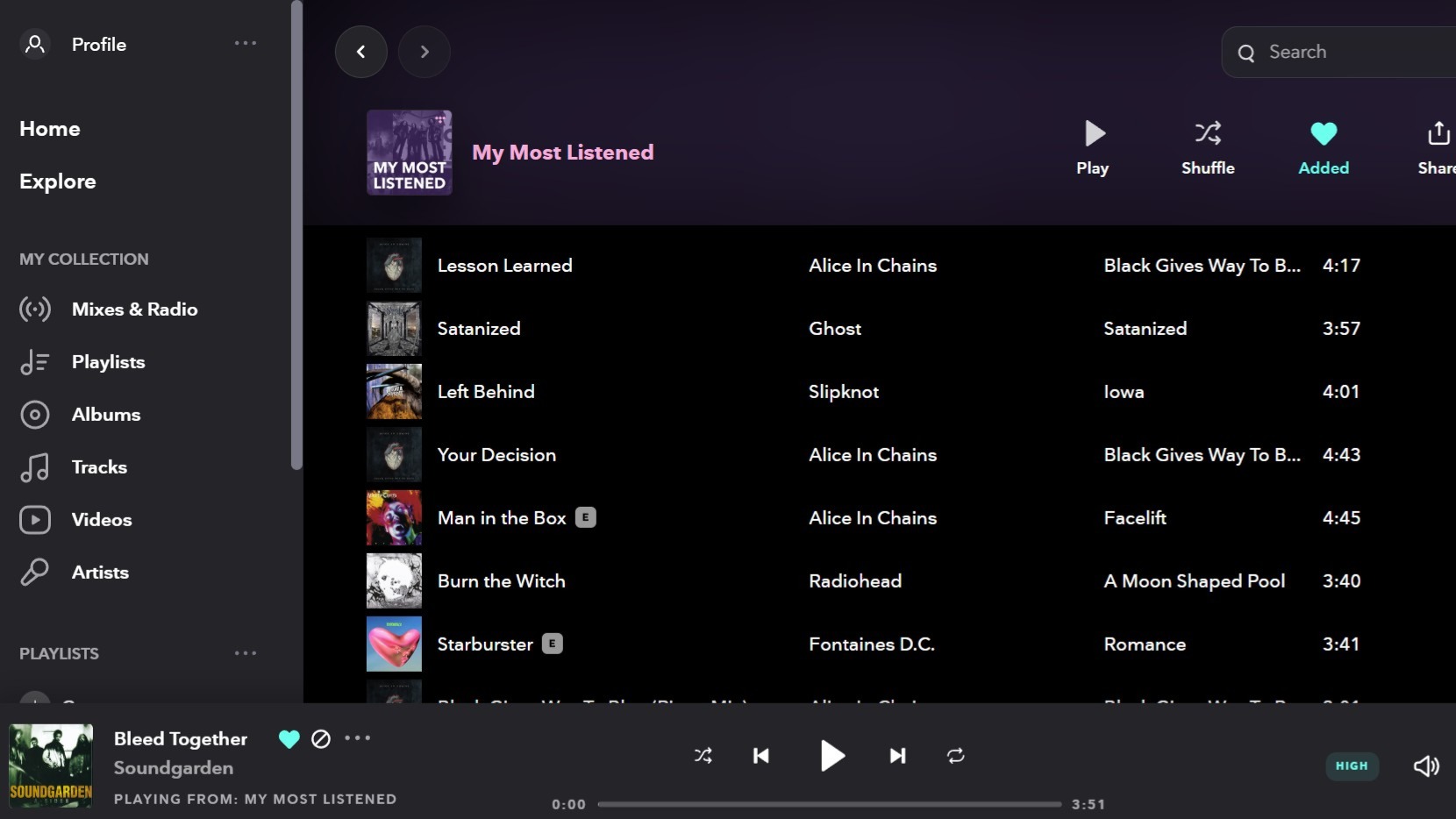
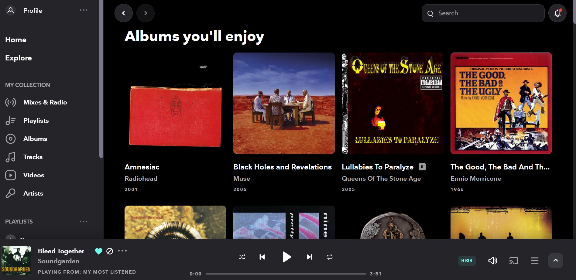
Spotify and Tidal don’t work like this, employing a needlessly separated system which splits tracks and albums (not to mention artists) into distinct entities. If you’ve liked those three Muse tracks above, they’ll appear in your track list, but go to albums and try to find Showbiz and nope, it’s not there.
You have to 'like' the album separately for anything to appear. Even if you do ‘Like’ the whole darn record, that will only appear in the ‘album’ section of your liked music. You then have to go through and individually like each track if you want them to appear in your separate list of liked tracks.
Things are a little clunky when it’s time to download tunes, too. This is easier on Spotify, through which you can either download a whole playlist, album or back catalogue with the touch of a button, or go through songs individually and, with a satisfying swipe, have them saved onto your device.
Not with Tidal. Here, you can save playlists, albums and collections as on Spotify, but picking a song individually that you want saved for that wi-fi-less flight to Copenhagen? Nope. Nobody seemed to think that such a feature would come in handy...
Not only that, but I’ve been trying to get my full collection of songs saved onto my iPhone for days now, and there are certain tunes which have stalled and refuse to budge, thus jamming the entire playlist like a spanner in the cogs of an industrial production line.
“Why not just cancel the songs that are causing the issue and get things moving again?” you reasonably ask. Nope. Tidal requires you to delete all of your downloads and start again.

Tidal isn't winning the CarPlay race
Adding to playlists is similarly rudimentary. Apple’s solution here is expectedly smooth – if you want to expand any given rundown, you can do so by going into any given list and pressing ‘add music’. You’ll then be taken to your music library but in a sort of ‘add mode’, with plus signs which let you quickly and easily pop any track you fancy onto your chosen playlist, a bit like shopping at the local supermarket.
Tidal, however, forces you to do things manually by going through the platform as normal and, every time, selecting the song, pressing add to playlist, then finding the one you want. That’s at least three extra steps.
Oh, and I haven’t even started on CarPlay yet. My regular commute around the M25 to our Reading office has given me plenty of time to assess the capabilities and shortcomings of Spotify’s implementation of the audio sharing platform, and to its credit, it does a fine job without glitches or glaring omissions.
Switching to Tidal has been a bit of a wrench in this regard, with several key features, such as the ability simply to fast-forward tracks or access a full album from a single song, missing from its arsenal. To use an apt car analogy, Spotify’s implementation is worthy of Bentley, Tidal’s is a mid-priced Ford Focus, and Qobuz… that’s like riding a bike while balancing a boombox in the basket. That's another story.
We were on the verge of greatness...
The real frustration is that Tidal is such a nearly-there platform that it would only take a couple of small, fixable tweaks to render it, in my eyes, pretty much perfect. I understand that making changes to any interface, no matter how basic, takes time and commitment on behalf of programmers and developers.
I recently spoke to some lovely chaps at Ruark about the trials and tribulations of having different fonts and languages on a simple digital radio display, and trust me, it takes a lot of hard graft.
The quality is all there, but it’s nothing without a platform people feel comfortable using. Tidal isn't miles away from the benchmark user experience offered by its rivals, but there is still ample room for improvement.
The lesson here is simple: sometimes what you need is a little bit of style to go with all of that substance.
MORE:
These are our favourite music streaming services
High End Munich 2025 preview: what to expect from the upcoming hi-fi show

Harry McKerrell is a senior staff writer at What Hi-Fi?. During his time at the publication, he has written countless news stories alongside features, advice and reviews of products ranging from floorstanding speakers and music streamers to over-ear headphones, wireless earbuds and portable DACs. He has covered launches from hi-fi and consumer tech brands, and major industry events including IFA, High End Munich and, of course, the Bristol Hi-Fi Show. When not at work he can be found playing hockey, practising the piano or trying to pet strangers' dogs.
You must confirm your public display name before commenting
Please logout and then login again, you will then be prompted to enter your display name.
